Recreating the Microsoft Word 2000 UI
I’m finally done with my homepage! I’ve completely moved into my new website!
The homepage wasn’t finished because I had fully executed my plans (I didn’t have one), rather it was because I had ran out of ideas for it.
I yearned for a blank page once more.
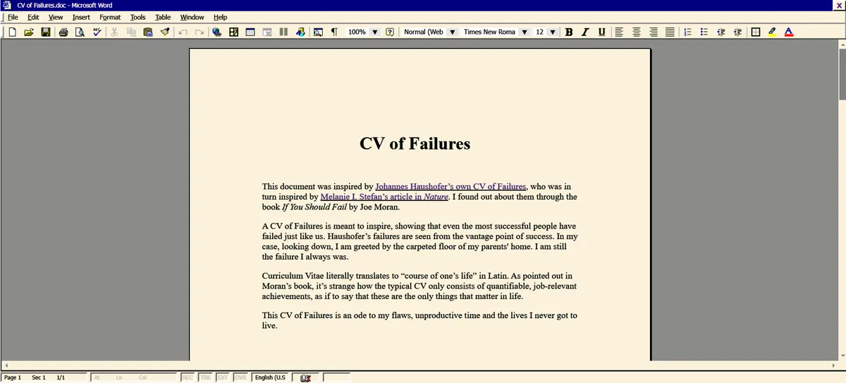
So I started working on the least intimidating of my planned pages – my CV of Failures. This time, I sketched out the full page, rather than singular elements. When I think of CVs, I think of the countless hours spent in word processors, squaring off and dicing my achievements into palatable bullet points, the impatient blinking cursor my only companion. I decided to have the page emulate the Microsoft Word 2000 UI.
I think this version of Word has my favourite design. I’m actually using it to draft this very post! There’s very little bloat and no stupid generative AI integration. Instead there’s a cute (but pretty unhelpful) office assistant that animates and makes sounds. There’s also this lovely 3d border around everything, making the UI look less flat and boring (a petty issue I have with LibreOffice and other modern word processors). This shift in design is likely influenced by the move from physical buttons to touchscreens.
This is the final page!
Recreating the Word 2000 UI in html felt like painting a master study. Amidst the silly syntax errors and spelling mistakes, I leaned a lot of interesting things! And I will be sharing some of them below!
Outset and Inset border (to make the div look 3d)
If you want a div to extrude, use an outset border:
#div{
	border-right: 2.5px outset grey; /*darker colour*/
	border-bottom 2.5px outset grey; /*darker colour*/
	border-left: 2.5px outset white; /*lighter colour*/
	border-top: 2.5px outset white; /*lighter colour*/
}
Styling the :hover of the above div with an inset border will allow it to depress like a physical button.
#div:hover{
	border-right: 2.5px inset white; /*darker colour*/
	border-bottom 2.5px inset white; /*darker colour*/
	border-left: 2.5px inset grey; /*lighter colour*/
	border-top: 2.5px inset grey; /*lighter colour*/
}
Outset and inset in these examples can be changed to achieve different effects!
Adding a border on hover when the div doesn’t have one originally will result in a bigger div on hover. This means that when multiple of those divs are lined up in a row, hovering over one will shift the others.
To prevent that, adjust the margin in the #div:hover. If things are shifting right when hovering, make margin-left a lower number than the original (you can even do negative margins, e.g. margin-left: -2px). Unfortunately, I haven’t worked out the logic for it, I just kept experimenting with numbers until it stopped moving.
Fuzzy Text
I noticed that the text in Word 2000 doesn’t look as crisp as every other piece of text in my computer. It’s in a lower resolution and is kinda fuzzy, feels like I took off my glasses. I like it!
The top row is my computer’s UI text, the bottom row is Word 2000
To achieve this “fuzziness”, just add
#div{
	text-shadow: 0 0 0.8px black; /*change colour to match font-color*/
	}
Blinking Cursor
Use this “│” in the html and give it it’s own div.
Now we style it!
#div{
	animation: blinking 1.0s steps(1) infinite; /*’blinking’ is what we’ll name the animation*/
}

@keyframes blinking{
	50% {visibility:hidden;}
	100% {visibility:visible;}
}
Command Bar Icons
After scouring the web for hours, I couldn’t find any uploads of the command bar icons. I found a bunch of other retro windows and Microsoft icons, but not what I’m looking for. So I recreated them!
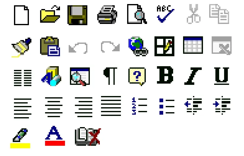
I think I got pretty close! Just don’t look too closely.
I used a 16x16 canvas, which was mistake. I had to squeeze and slightly distort some of the icons because I couldn’t get enough detail on the canvas. Every pixel made a huge difference on the final zoomed out look.
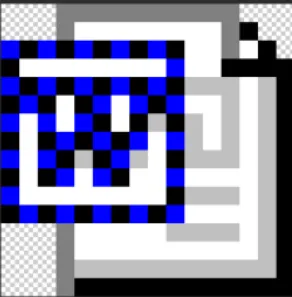
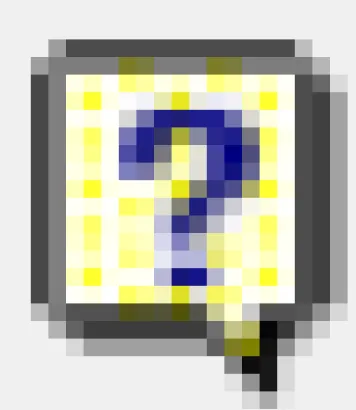
⬆️ Screenshot of word2000 logo (uploaded by ms-dos5 on Tumblr) close-up
I was surprised to find that the Word logo wasn’t a solid colour, but a checkerboard pattern!
⬆️ Screenshot of help icon.
The same goes for the help icon! I don’t really know why it was coloured this way. Did they have a limited palette back then?
I’ve uploaded the recreations I made in the F2U page on my website. Anyone can download and use it! Credit’s not necessary but appreciated. These bootleg icons are my little contributions to the internet!
Also, the UI uses the Tahoma typeface.
Resources I came across
Windows 98 icon viewer by Alex Meub
Over 2000 Retro Windows Icons uploaded by SnowyFloof on Internet Archive
Collection of Microsoft Office Icons uploaded by ms-dos5 from Tumblr
Life update!
My two week break from self-promotion is gonna be over soon.(;´д`)ゞ
Nothing really changed during my break, which tells me that whatever I was doing before probably wasn't working. Moving forward, I'll scrap all my self-promotion tactics before my break and come up with some fresh ideas.
All the advice from that 'creative career workshop' I wasted two months on seem to be useless. In hindsight, I shouldn't have listened to people who weren't even successful illustrators themselves.
I'm glad I took this break! I even got a new skill out of it (learning html)! Now I realise that, for better or worse, there really isn't anyone watching, anyone caring.
I have all the time in the world.